Project
Lumi Dental
Case study
Website design · UX/UI · Development
A premium dental clinic concept combining editorial elegance, clear treatment categories and a direct path to appointment booking.
Visual identity
Deep burgundy, warm ivory and gold details create a distinctive premium identity, supported by elegant editorial typography.
Project challenge
The concept needed to combine an exclusive clinic image with warmth and reassurance, while making the four core specialisations immediately accessible.
Project goals
Every interface element supports readability, brand credibility and a simple, natural user experience.
Minimalist design, professional photography and clear communication.
Implantology, orthodontics, aesthetic dentistry and prevention presented in a clear system.
Visible calls to action leading directly to appointment booking.
A consistent experience across phones, tablets and desktop screens.
Key subpages
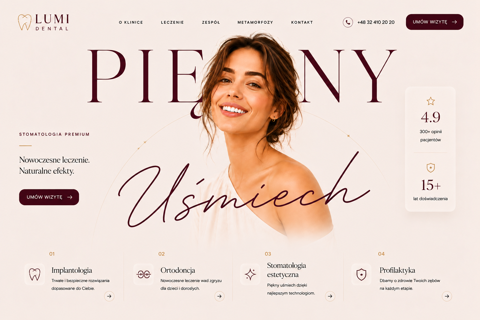
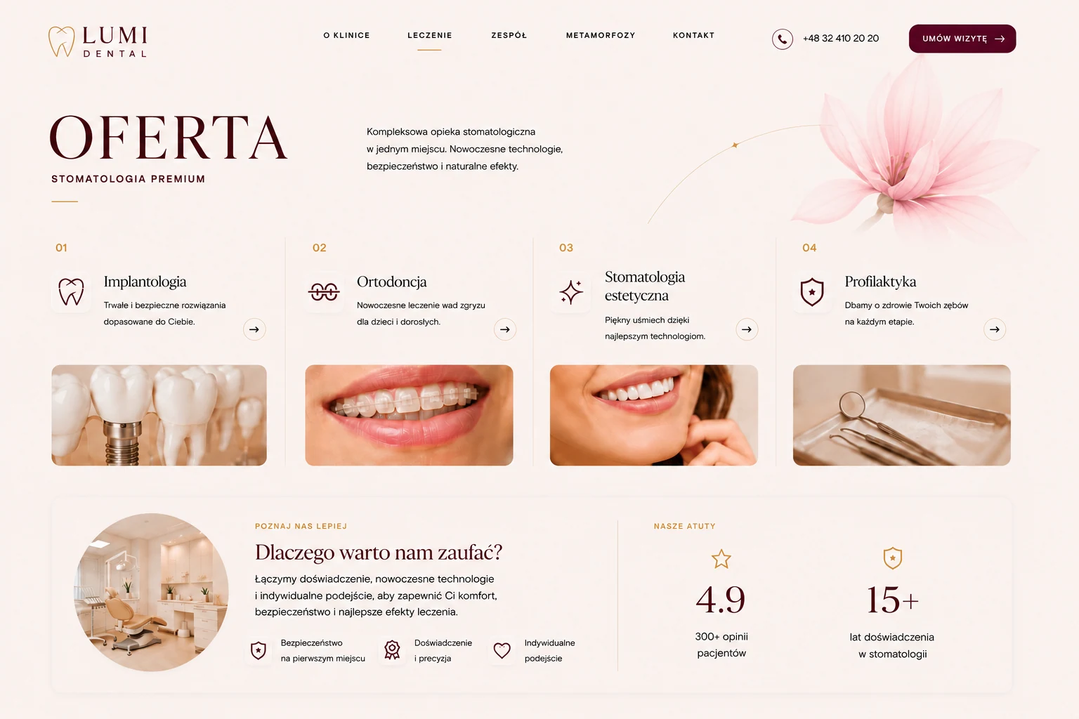
The homepage and services page create one coherent journey: from the first impression, through treatment discovery, to booking an appointment.
An editorial hero with a central portrait, strong CTA, patient rating and shortcuts to four key specialisations.
A clear presentation of four treatment areas, supported by imagery, key benefits and trust-building reasons to choose the clinic.
Responsive design
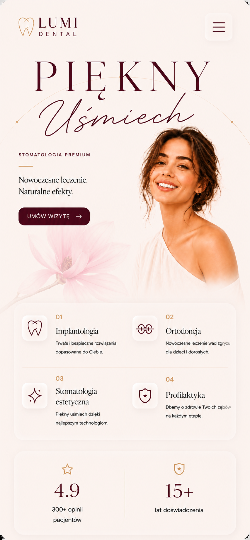
The mobile version preserves the elegance of the desktop design while arranging content into a natural vertical rhythm and guiding users towards key services and booking.
The logo, brand promise and appointment CTA create a clear hierarchy above the fold.
Four core specialisations are arranged in a transparent grid designed for mobile.
A large menu button and generous interactive areas make one-handed use comfortable.
Patient ratings and the clinic’s experience remain prominent on a smaller screen.
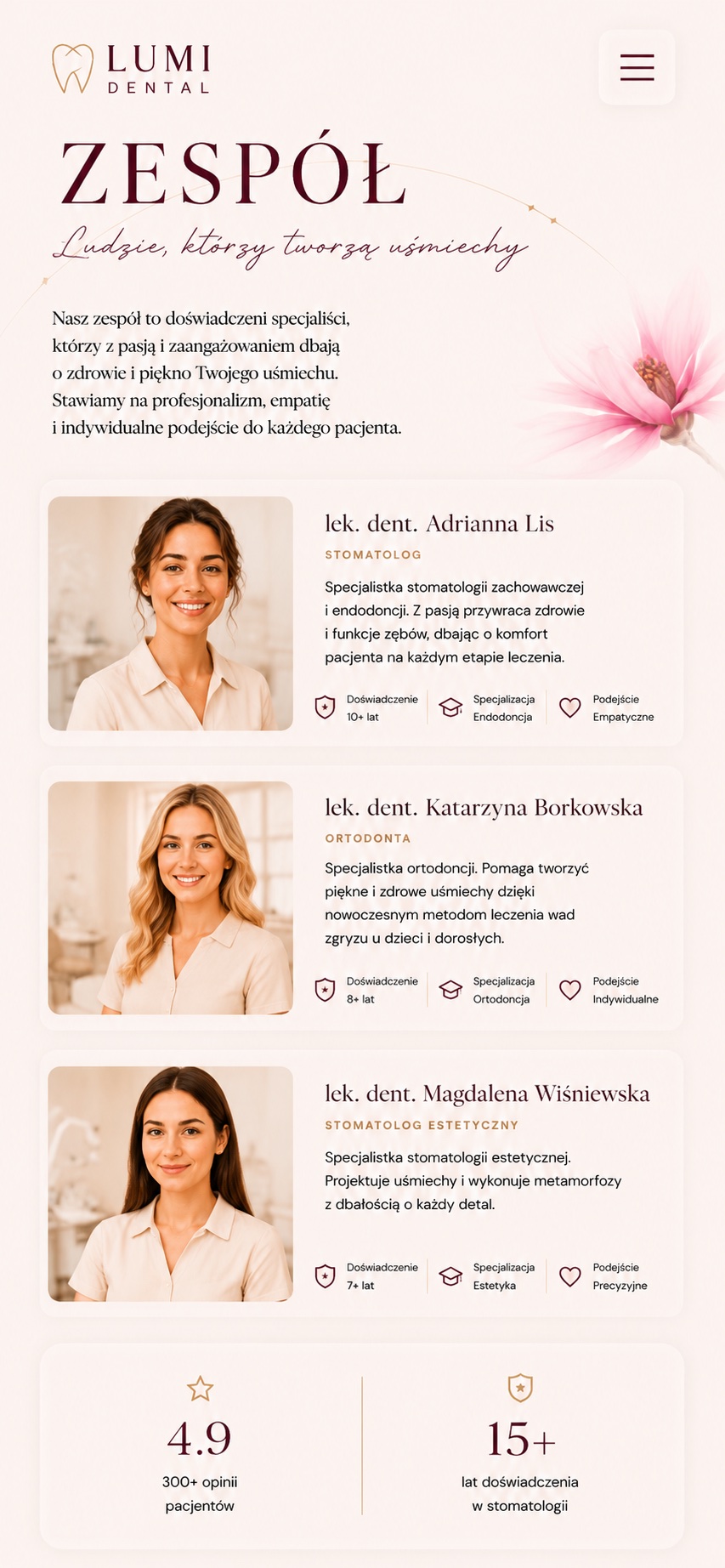
Large, natural portraits make the clinic feel more human and trustworthy from the very first moment.
Specialisation, experience and treatment scope are visible without opening additional screens.
Every specialist follows the same system, making the team quick to understand and compare.
Patients know who will take care of them and what to expect before making contact.